
Exploring fun typography trivia uncovers fascinating stories behind the letters, fonts, and punctuation marks we read every day. From Gutenberg’s mechanical metal press to digital staples like Comic Sans, typography trivia reveals how historical printing tools, famous designers, and unexpected accidents shaped modern written communication.
Have you ever wondered why we call capital letters “uppercase” or why someone created the world’s most debated font for a digital yellow cartoon dog? Exploring fun typography trivia turns ordinary everyday reading into an exciting visual scavenger hunt.
Every single letterform you see on road signs, cereal boxes, and computer screens carries centuries of art, rivalry, and brilliant engineering behind it.
Discovering these fun typography trivia stories gives you a brand-new appreciation for how tiny typographic choices quietly shape our thoughts, choices, and emotions.
Ready to see how fun typography trivia can transform you into the ultimate design history expert at your next quiz night? Let’s explore Gutenberg’s metal blocks, famous font rivalries, quirky punctuation marks, and secret typesetting jargon together!
The Secret History Behind Everyday Type Terms
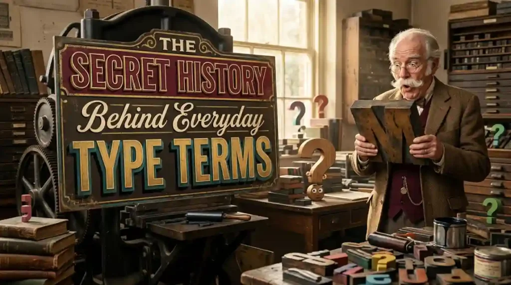
Long before digital keyboards and laptop screens existed, setting words onto paper required heavy manual labor, molten lead, and physical wooden trays. Early printers crafted individual metal blocks for every single letter, number, and punctuation mark in their shop inventory.
Many phrases we still use in modern digital software originated directly on the dusty floors of Renaissance printing workshops.
Understanding these historical origins makes navigating modern word processors feel like connecting directly with ancient craftsmanship.
Movable metal type blocks inside a traditional letterpress tray. Source: Wikipedia
Why We Say Uppercase and Lowercase
Back in traditional letterpress workshops, compositors arranged physical metal letter blocks by hand inside wooden storage cabinets called type cases. To work efficiently, printers organized these heavy trays into two main vertical sections on their wooden assembly benches.
Printers stored capital letters in the higher, harder-to-reach drawers known as the “uppercase.”
Meanwhile, the small letters used far more frequently sat conveniently in the accessible bottom drawers known as the “lowercase.”
Even though we type on glass screens today, we still use these physical workshop storage terms every single day.
The True Difference Between a Typeface and a Font
Most people use the words “font” and “typeface” interchangeably, but in classic design terminology, they describe two distinct concepts. Think of a typeface as the creative musical album, while a font represents an individual track on that specific record.
Understanding the clear distinction between typefaces and individual fonts. Source: GeeksforGeeks
A typeface is the overall visual family design, such as Helvetica, Times New Roman, or Garamond.
A font refers to the specific physical or digital instance of that design, including its exact weight, size, and style (like Helvetica Bold 12pt).
Here is a handy breakdown summarizing fundamental typography terms and their real-world origins.
Leading and Kerning: Spacing Secrets of Master Printers
When letterpress printers wanted to add vertical space between lines of text, they physically inserted thin strips of soft lead metal between rows. Professional graphic designers still pronounce vertical line spacing as “leading” rather than “leeding.”
Horizontal spacing between individual letter pairs is called kerning, derived from the French word carne, meaning corner or edge.
Printers would notch out the corners of metal blocks so letters like “V” and “A” could nestle closer together without awkward gaps.
Today, bad kerning, often called “keming” by typography geeks, can cause hilarious visual errors where letters accidentally merge into completely different words on public signs.
Iconic Fonts and the Fascinating Stories Behind Them
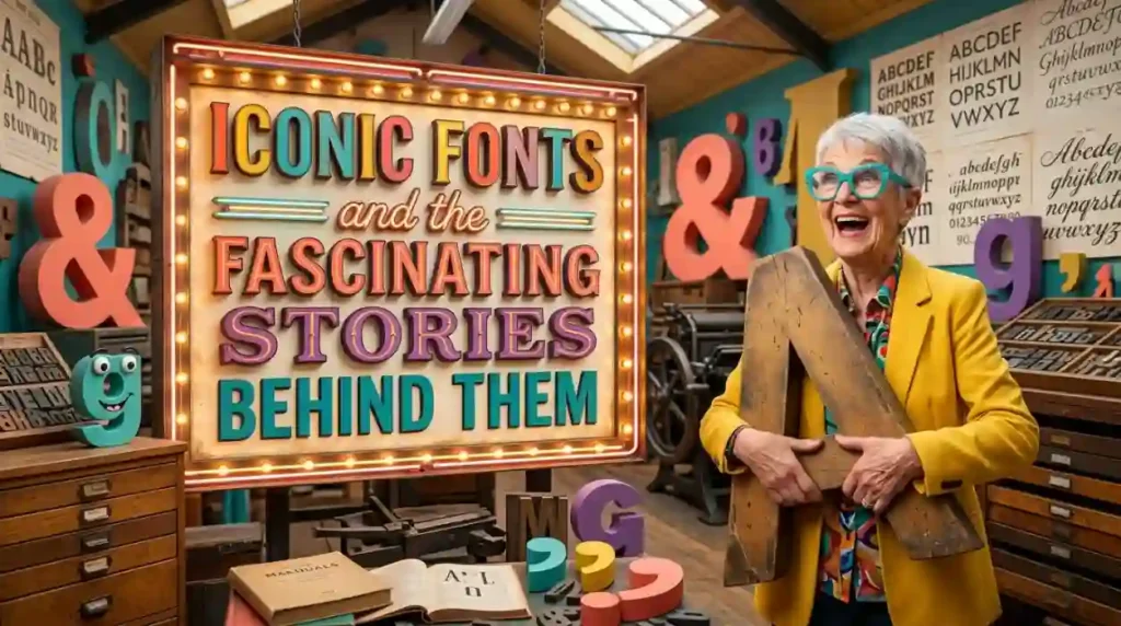
Every famous font on your computer drop-down menu has an origin story packed with ambition, artistic vision, and occasional drama. Some were designed for high-speed newspaper presses, while others were built specifically to suit early low-resolution computer monitors.
Exploring how famous typefaces came to be reveals how technical limits often inspire brilliant design breakthroughs.
Let’s take a closer look at four of the world’s most recognizable text designs.
Times New Roman: A Newspaper Feud Born in 1932
In 1931, British typographer Stanley Morison publicly criticized The Times of London for using outdated, hard-to-read Victorian newspaper typefaces. Taking the criticism to heart, the newspaper hired Morison and draftsman Victor Lardent to design an entirely new, highly efficient typeface.
They created Times New Roman, optimizing the letterforms with sturdy serifs and narrow proportions to maximize readable text across narrow news columns.
The new design debuted in October 1932, allowing the newspaper to print more words per page while using less physical ink.
Decades later, Microsoft adopted it as the default font for Word, making it a global standard for academic essays and formal documents.
Helvetica: The Swiss Masterpiece That Conquered the World
Created in 1957 by Max Miedinger and Eduard Hoffmann at the Haas Type Foundry in Switzerland, Helvetica was originally named Neue Haas Grotesk. The designers wanted to create a neutral, perfectly balanced sans-serif typeface that communicated clear information without conveying personal bias.
When the marketing firm Stempel pitched the font to international markets in 1960, they renamed it Helvetica, derived from Helvetia, the Latin name for Switzerland.
Its clean lines, uniform stroke thickness, and timeless clarity made it an instant favorite for corporate branding around the globe.
Today, giant brands like Apple, Target, Lufthansa, and Panasonic rely on Helvetica to deliver their primary corporate identity.
Comic Sans: The Accidental Pop-Culture Sensation
Few font designs provoke as much passionate debate as Comic Sans, created by Microsoft designer Vincent Connare in 1994. Connare noticed that a beta version of Microsoft Bob used formal Times New Roman inside cartoon speech bubbles spoken by a virtual yellow dog named Rover.
Feeling that Times New Roman looked absurdly formal for a cartoon dog, Connare quickly drew inspiration from classic comic books like Watchmen and The Dark Knight Returns.
Although his informal design missed the deadline for Microsoft Bob, engineers included it in the Windows 95 Plus! Pack as an optional system font.
Everyday computer users embraced its friendly, approachable aesthetic, using it everywhere from casual birthday invites to formal medical notices.
Futura and the Epic Quest to Reach the Moon
Designed by Paul Renner in 1927, Futura represented a radical departure from traditional handwriting-based letter styles. Renner built Futura using clean geometric shapes perfect circles, triangles, and sharp right angles inspired by the German Bauhaus design movement.
Its forward-looking, modern aesthetic made it the ideal choice for landmark cultural moments throughout the twentieth century.
When Apollo 11 astronauts landed on the lunar surface in July 1969, they left behind a commemorative steel plaque attached to the lunar module.
The famous inscription reading “We came in peace for all people” was engraved entirely in capital letters of Futura, making it the very first font to reside on the Moon.
Punctuation Secrets and Typographic Curiosities
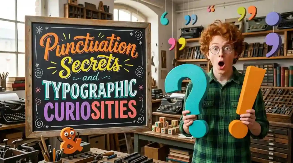
Beyond standard letters, the written language contains a fascinating world of obscure symbols, forgotten marks, and typographic accidents. Many marks were invented by passionate authors attempting to capture subtle vocal tones, sarcastic humor, or rhetorical pauses on printed pages.
Discovering these unusual symbols shows how language continually evolves to match human expression.
Let’s examine some of the most intriguing punctuation curiosities in typographic history.
The Interrobang: The Fusion of Surprise and Curiosity
In 1962, American advertising executive Martin K. Speckter noticed that magazine advertisements frequently paired exclamation points with question marks to express intense disbelief. Believing two separate punctuation marks looked messy in headline layouts, Speckter designed a single combined symbol called the interrobang (‽).
He merged a question mark and an exclamation point into one single glyph, naming it after the Latin word for question (interrogatio) and printers’ slang for exclamation marks (bang).
The mark enjoyed a wave of popularity during the 1960s, appearing on Remington typewriters and inside specialized metal font sets.
While it eventually fell out of mainstream daily use, it remains a beloved cult symbol among punctuation enthusiasts and typography fans worldwide.
The Mysterious Case of the Octothorpe (#)
Long before the hash symbol became famous as the social media hashtag, it carried a long history of practical uses across science, trade, and telecommunications. The symbol evolved from the Latin abbreviation lb, short for libra pondo (pound weight), when medieval scribes drew a horizontal bar across the letters to prevent confusion.
In the 1960s, Bell Labs engineers added the key to telephone keypads to send automated control signals to central phone switches.
Legend claims engineer Don MacPherson named the symbol the “octothorpe,” combining octo (for its eight points) with Thorpe, honoring Olympic athlete Jim Thorpe.
Today, the symbol has transformed once again, serving as the universal digital tag for trending topics across global social networks.
Forgotten Marks: The Ampersand and the Irony Mark
- The Ampersand (&): Originally a visual ligature combining the Latin letters “E” and “T” (spelling et, meaning “and”), the ampersand was actually recited as the 27th letter of the English alphabet in early 19th-century British schools.
- The Irony Mark (⸮): Proposed by French author Hervé Bazin in 1966, this backwards question mark was designed to alert readers that a sentence was meant to be interpreted as sarcastic or ironic.
- The Pilcrow (¶): Used by medieval monks to mark the start of a new thought before structural paragraph indents became standard printing practice.
How Fonts Secretly Influence Your Daily Choices
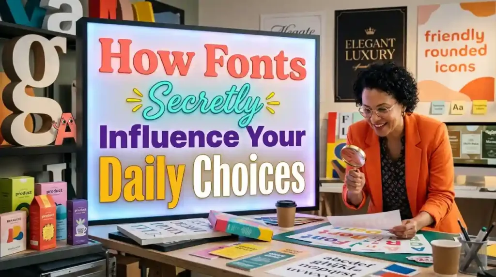
Typography is far more than an aesthetic choice; it operates as a powerful psychological tool that quietly guides human decision-making. Marketers, psychologists, and UX designers carefully select fonts to trigger specific emotional responses, build trust, or influence buying habits.
Scientific studies prove that the visual shape of text directly alters how our brains process written information.
Here is how subtle typography choices impact your daily life without you ever realizing it.
The Psychology of Menu Fonts and Dining Bills
Restaurateurs carefully select fonts to shape how diners perceive meal quality, flavor complexity, and pricing value. Elegant script fonts or classical serif designs lead customers to expect higher culinary craft, making them willing to pay higher prices for entrees.
Conversely, simple sans-serif fonts arranged on clean layouts make fast-casual dining menus feel approachable, quick, and budget-friendly.
Additionally, removing dollar signs ($) and using light, unbolded typography on bill receipts reduces the emotional “pain of paying” for customers.
How Font Weight Alters Perceived Difficulty
Psychological experiments demonstrate that readable, simple typography makes complex tasks feel significantly easier to accomplish. When researchers asked participants to follow exercise instructions printed in clean Arial font, volunteers estimated the routine would take just eight minutes.
However, when given the same instructions printed in a complex, decorative cursive font, participants estimated the workout would take nearly fifteen minutes.
Using clean, highly legible typefaces increases user confidence, reduces mental fatigue, and improves comprehension across user manuals and educational materials.
Practice Exercise
Test your knowledge of typographic history, famous font origins, and punctuation curiosities with this quick five-question multiple-choice quiz.
- Why were capital letters traditionally referred to as “uppercase” letters in printing history?
A. Because they were considered superior to small letters in formal grammar
B. Because they were stored in the higher, top wooden drawers in letterpress workshops
C. Because they were always painted using bright upper-shelf inks
D. Because printers held them up high toward the ceiling to dry - What famous font was designed in 1931 specifically to improve reading efficiency for a British newspaper?
A. Times New Roman
B. Comic Sans
C. Helvetica
D. Futura - Which font achieved historic fame by being engraved on a commemorative plaque left on the Moon during the Apollo 11 mission?
A. Papyrus
B. Futura
C. Impact
D. Garamond - What is the official name of the single punctuation symbol that combines a question mark and an exclamation point (‽)?
A. Octothorpe
B. Pilcrow
C. Interrobang
D. Ampersand - How did early letterpress printers adjust the vertical spacing (“leading”) between lines of text?
A. By stretching the paper sheets before printing
B. By physically inserting thin strips of soft lead metal between lines of type
C. By painting white lines between sentences with brushes
D. By carving deeper grooves into the wooden printing press frame
Answer Key:
- B
- A
- B
- C
- B
Frequently Asked Questions
What is the difference between a serif font and a sans-serif font?
Serif fonts feature decorative strokes or “feet” extending from the ends of letter stems, such as Times New Roman or Garamond. Sans-serif fonts (“sans” meaning “without”) feature clean, plain letter ends, such as Helvetica or Arial, offering a modern aesthetic.
Why is Comic Sans criticized by professional graphic designers?
Comic Sans is criticized primarily because people frequently misuse it in formal contexts, such as business reports, medical notices, or serious announcements. While designed intentionally for informal cartoon bubbles, its casual nature clashes awkwardly with serious professional communication.
What is a pangram and why do typographers use them?
A pangram is a short sentence that uses every single letter of the alphabet at least once, such as “The quick brown fox jumps over the lazy dog.” Typographers use pangrams to test, evaluate, and display every character of a new typeface design cleanly inside a single line.
Who invented movable metal type printing in Europe?
Johannes Gutenberg invented the European movable metal type printing press around 1440 in Mainz, Germany. His mechanical innovation allowed books to be mass-produced quickly, dramatically lowering the cost of written knowledge and sparking the European Renaissance.
What is the most widely used font for public highway signs in the United States?
Clearview and Highway Gothic are the two primary typeface families used on official highway directional signage across the United States. Designed specifically for high legibility at fast speeds, their open letter shapes allow drivers to read city names clearly from long distances at night.
Conclusion
Diving into fun typography trivia proves that the letters surrounding us are filled with history, art, and human ingenuity. From Gutenberg’s wooden trays and Moon-bound fonts to clever punctuation marks, the world of type offers endless fascinating details to discover.
Understanding typographic design helps you notice the subtle details that make reading enjoyable, engaging, and clear every single day.
Keep your eyes open for interesting font choices on posters, book covers, and public signs as you go about your week.
Share your favorite typography fun facts with fellow design fans today, explore new font families, and celebrate the amazing art behind the written word!

Jack Olive is the creative mind behind buzzgiggles.com, a fun-focused website built to bring smiles, laughter, and lighthearted entertainment to everyday life. With a passion for humor and enjoyable content, Jack Olive creates and shares playful ideas, amusing stories, entertaining discoveries, and cheerful moments designed for readers of all kinds.
Through buzzgiggles.com, Jack Olive combines creativity, curiosity, and a positive sense of humor to explore the lighter side of life. Whether visitors are looking for a quick laugh, something interesting to share, or a cheerful break from their routine, the website offers content created with fun in mind. Jack Olive believes great entertainment should be easy to enjoy, memorable, and capable of brightening someone’s day.