A fun sans font is a playful, clean typeface designed without decorative stroke extensions (serifs) at the ends of its letters. Featuring rounded corners, casual stroke angles, or slightly bouncy proportions, fun sans typefaces bring warmth, approachability, and high legibility to digital interfaces, branding, and casual print designs.
Have you ever opened a design draft and felt like traditional corporate typefaces were crushing the joyful spirit of your message? Choosing a playful, fun sans typeface brings fresh energy and friendly character straight to your layout.
This clean typography style strips away formal traditional serifs while introducing warm, hand-drawn curves and bouncy proportions. Using a versatile fun sans font lets your visual branding feel open, welcoming, and delightfully human.
Whether you are crafting birthday party invitations, designing casual app icons, or building an energetic modern brand, font choice changes everything. The right lettering holds reader attention while keeping digital screens easy to navigate.
Let’s explore how a cheerful, fun sans typeface balances casual personality with high legibility across digital and print media. You are going to love upgrading your design toolkit!
What Makes a Typeface a Fun Sans?
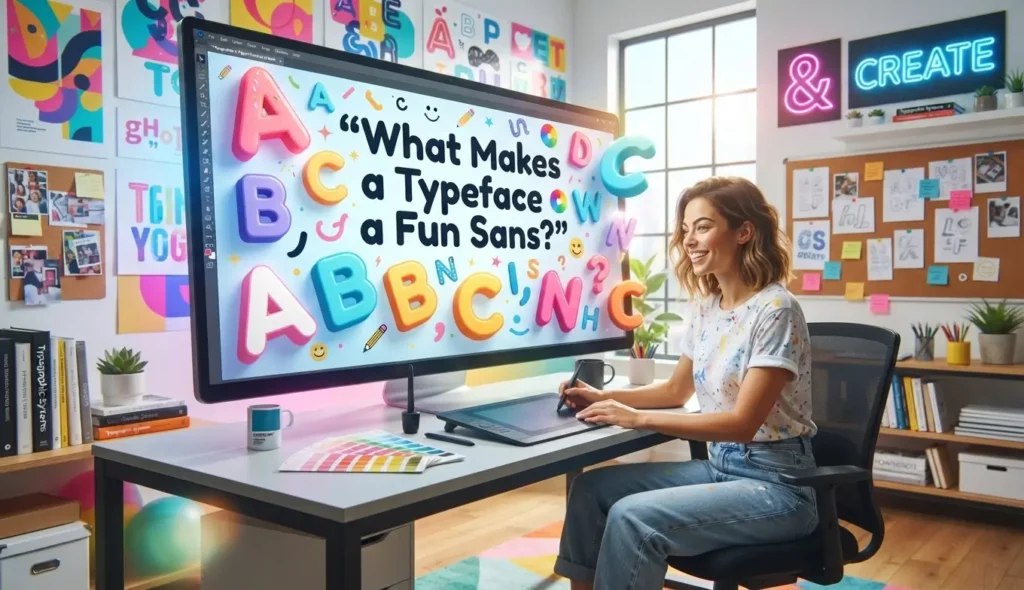
Typography shapes how people perceive your brand before they even read a single sentence. Standard sans-serif fonts focus on strict geometric alignment and neutrality.
A fun sans typeface keeps that clean, modern foundation but injects warmth, personality, and expressive flair into letterforms.
Anatomy of Casual and Playful Sans-Serif Letterforms
The magic of a playful sans lies in subtle design details that break rigid traditional typographic rules. Type designers introduce soft curves, irregular counters, and uneven baselines to create a sense of movement.
Understanding these structural elements helps you select typefaces that match your project’s tone.
- Softened Corners: Slightly rounded stroke edges make letters look soft and touchable instead of sharp and corporate.
- Bouncy Baselines: Letter bottoms sit slightly above or below the baseline, mimicking natural hand lettering.
- Organic Counters: The inner loops of letters like “o,” “p,” and “b” feature slightly asymmetrical oval shapes.
- Wide Apertures: Large openings in letters like “c” and “e” improve clarity while creating a friendly, open appearance.
The Psychology of Friendly Typography
Human brains naturally associate smooth, rounded shapes with safety, warmth, and friendliness. When readers see rigid, sharp font lines, their minds process a formal or serious tone.
Switching to a playful, rounded sans-serif lowers psychological friction. It creates an inviting visual environment that encourages readers to relax and engage with your content.
Popular Categories of Casual and Playful Sans Fonts
Not all playful typefaces are built the same way. Depending on your design goals, you might need a bold display header or a soft, subtle body font.
Exploring distinct categories makes it easier to select the perfect font family for your project.
Soft Rounded Sans-Serif Styles
Rounded fonts feature soft, pill-like stroke ends that eliminate sharp corners. Classic examples like Varela Round, Fredoka One, and Quicksand lead this category with smooth geometry.
These fonts work exceptionally well for mobile apps, educational platforms, and casual lifestyle brands because they look clean yet accessible.
Hand-Drawn and Marker Style Sans
Hand-drawn sans-serif typefaces preserve the natural imperfections of marker pens and brush strokes. They bring a human, personal touch to digital graphics and event posters.
Featuring organic stroke weight variations, these fonts feel authentic and personal, making them ideal for casual restaurants and craft products.
Retro and Bubble Geometric Styles
Retro sans-serif fonts take inspiration from 1970s pop art, vintage cartoons, and groovy poster design. They showcase exaggerated thick stems, tight letter spacing, and playful curves.
These bold display typefaces draw immediate attention on packaging designs, sticker packs, and merchandise graphics.
Best Design Use Cases for Playful Sans Typefaces
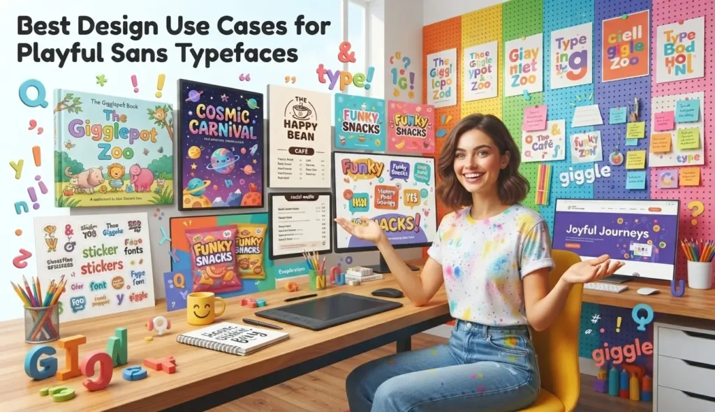
Choosing where to apply expressive typography is just as important as selecting the font itself. Overusing decorative styles can clutter your layout, whereas strategic placement creates striking visual hierarchy.
Here are the most effective applications for energetic sans-serif designs.
Children’s Media and Educational Platforms
Educational software and children’s books rely heavily on friendly, easy-to-read letterforms. Younger readers process simple, open letter shapes much faster than complex serif structures.
Using warm, rounded fonts reduces visual fatigue during reading practice while keeping learning materials feel like play.
Food, Beverage, and Casual Lifestyle Branding
Casual dining menus, juice bar logos, and snack packaging thrive on approachable visual identities. A rigid corporate font feels out of place on a fun ice cream wrapper or smoothie bottle.
A bold, curvy sans typeface communicates taste, freshness, and joyful indulgence instantly on retail shelves.
User Interfaces (UI) and Onboarding Screens
Modern digital apps use friendly typography to guide users through initial setup screens without causing stress. Welcome banners, empty-state screens, and reward pop-ups benefit greatly from warm letterforms.
A subtle fun sans typeface turns standard technical alerts into friendly, encouraging conversations.
Pairing Playful Fonts with Body Text: Master Guidelines
Combining different fonts requires a careful balance between harmony and contrast. Pairing two overly expressive fonts creates visual noise, while pairing identical fonts looks bland.
Following clear pairing rules ensures your header fonts shine without sacrificing body text readability.
Balancing Expressive Display Headers with Clean Body Fonts
When using a loud, highly decorative display font for your title, pair it with a quiet, neutral sans-serif for body paragraphs. Let your main header hold all the personality while the body text does the heavy lifting for reading comprehension.
This contrast creates a clear visual hierarchy, guiding the reader’s eye naturally down the page.
Matching x-Height and Weight Proportions
When pairing fonts side by side, check their x-heights—the height of lowercase letters like “x” relative to capital letters. Fonts with similar x-heights feel balanced when placed in adjacent columns or navigation bars.
Matching stroke weights prevents one font from looking washed out next to a heavy display title.
Technical Font Selection: Licensing and Web Performance
Behind every great font choice sits technical execution. A font that looks stunning in design software must also load quickly on web pages and carry proper legal licensing.
Paying attention to technical details saves your project from slow load times and legal headaches.
Navigating Font Licenses for Commercial Use
Before launching a commercial website or product packaging line, carefully verify your font license. Desktop licenses allow you to install fonts on personal computers for print design work.
Webfont licenses allow you to embed custom font files into live websites based on monthly page views. Free platforms like Google Fonts offer open-source typefaces suitable for commercial projects without licensing fees.
Web Font Optimization and Load Times
Loading multiple heavy font files can slow down your site speed, hurting user experience and search engine rankings. Every extra font weight (bold, italic, light) adds file size to your web pages.
Limit your web typography selections to two font families and a maximum of three total weights to keep your site fast and responsive.
Common Mistakes to Avoid with Expressive Typography
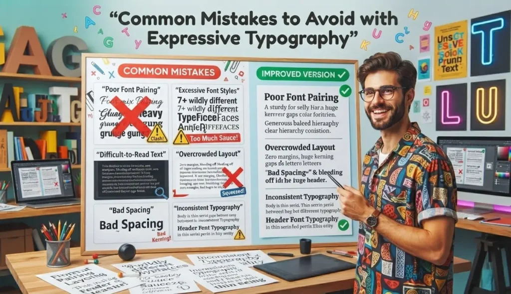
Even high-quality typefaces can ruin a design if applied incorrectly. Understanding common formatting errors helps you maintain clean visual hierarchy across all digital screens.
Avoid these frequent mistakes when working with playful lettering styles.
Overcrowding Letter Spacing (Tracking)
Playful fonts with rounded edges need breathing room to stay legible. Squeezing letters too tightly together causes curves to merge, turning words into difficult blobs.
Increase letter spacing slightly on display titles to highlight unique letter shapes and maintain high clarity.
Using Decorative Fonts for Long Paragraphs
Never use highly decorative or hand-drawn fonts for long body paragraphs. Reading a 300-word set in a bouncy marker font causes severe eye strain for your readers.
Reserve expressive styles exclusively for short headlines, button labels, and callout badges.
Practice Exercise
Test your understanding of typography rules, font pairing strategies, and technical performance with these 5 multiple-choice questions.
- Which visual characteristic is commonly found in a rounded fun sans typeface?
A. Sharp, elongated serifs at stroke ends
B. Softened, pill-like corners on letter edges
C. Intricate calligraphic flourishes
D. Variable high-contrast thick and thin strokes - Why should decorative display fonts be avoided for long body paragraphs?
A. They take up too much physical memory on web servers.
B. They cause visual eye strain and reduce reading speed over long texts.
C. They can only be printed using black ink.
D. They automatically disappear on mobile screens. - What is the main benefit of pairing an expressive display header with a neutral body font?
A. It eliminates the need for images in your design layout.
B. It creates clear visual hierarchy while preserving high readability.
C. It reduces website development costs by half.
D. It forces all text to fit onto a single line. - Which metric determines the relative height of lowercase letters in a font family?
A. Kerning ratio
B. Stroke weight index
C. x-Height
D. Ascender angle - How does limiting font weights help web performance?
A. It changes the background color of the web browser.
B. It reduces overall page file size, leading to faster web page load times.|
C. It prevents users from copying text from your site.
D. It increases screen resolution on desktop computers automatically.
Answer Key:
- B
- B
- B
- C
- B
FAQs
What is the difference between a standard sans-serif and a fun sans font?
A standard sans-serif focuses on neutral, geometric precision for formal use. A fun sans font adds warm personality through rounded corners, casual stroke weights, and bouncy baselines while maintaining high legibility.
Are rounded sans fonts good for professional business websites?
Yes, rounded sans typefaces work brilliantly for modern tech platforms, casual service brands, and educational sites. They make your business feel approachable, friendly, and customer-focused without looking unstructured.
Can I use free Google Fonts for commercial graphic projects?
Yes, fonts available on Google Fonts are open-source and free for both personal and commercial use. Always double-check individual license files included with the font download to ensure compliance.
How do I choose the right font weight for digital screen headers?
Select bold or semi-bold weights for digital headers to ensure strong contrast against background colors. Heavier weights draw immediate user attention and improve readability on smaller mobile devices.
What is font kerning and why does it matter for display titles?
Kerning is the adjustment of space between individual letter pairs to create visually balanced spacing. Proper kerning prevents awkward gaps between capital letters, ensuring headlines look smooth and professionally designed.
Are hand-drawn sans fonts accessible for users with visual impairments?
Some highly irregular hand-drawn fonts can be difficult for visually impaired users to read. Choose soft, geometric rounded fonts with wide apertures to maintain high web accessibility standards.
Conclusion
Incorporating a playful, fun sans typeface into your design toolkit gives your projects a warm, human touch that connects with readers. By balancing expressive display titles with clean body text, you keep layouts visually engaging without sacrificing clarity.
Pay attention to technical performance, license requirements, and proper letter spacing to deliver professional results across print and web formats. Friendly typography builds trust, encourages interaction, and makes everyday content a joy to read.
Pick your favorite rounded sans font, experiment with creative pairings, and bring your next design project to life today!

Jack Olive is the creative mind behind buzzgiggles.com, a fun-focused website built to bring smiles, laughter, and lighthearted entertainment to everyday life. With a passion for humor and enjoyable content, Jack Olive creates and shares playful ideas, amusing stories, entertaining discoveries, and cheerful moments designed for readers of all kinds.
Through buzzgiggles.com, Jack Olive combines creativity, curiosity, and a positive sense of humor to explore the lighter side of life. Whether visitors are looking for a quick laugh, something interesting to share, or a cheerful break from their routine, the website offers content created with fun in mind. Jack Olive believes great entertainment should be easy to enjoy, memorable, and capable of brightening someone’s day.